Choosing an aesthetic for your business can be overwhelming, and with so many restaurant design and decor ideas out there, it’s hard to know where to begin. As you open your new restaurant, you’ll have a lot of decisions to make: from choosing your restaurant POS to selecting the best napkins and everything in-between.
To help narrow down your options, we’ve compiled a list of 12 restaurant design ideas, along with tips from HGTV’s Taniya Nayak to help you decide which look is right for your menu, location, and target customers.
12 Restaurant Design and Decor Ideas
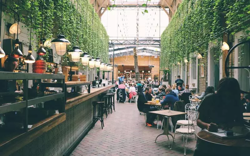
- Typography
When done right, incorporating typography into your decor is often a hit. Bold graphics, marquee letters, diagrams, and charts are all fun (and informative) ways to add details to your design scheme. Old-school neon signs are a big hit right now, too—try getting one custom-made with a quote or phrase that reflects the vibe of your restaurant.
 picture: restaurant typography
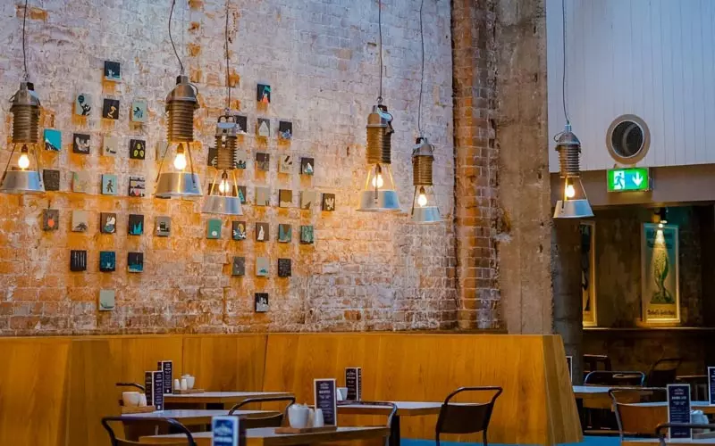
- Support local artists
If you have a large, open wall space that you want to design on a budget, reach out to local talent for help. By creating a gallery-style wall featuring a new artist or group of artists either monthly or quarterly, you get a rotating collection of unique decor, and local artists get their work seen and potentially sold.
- Murals and wall art
Aside from a gallery wall, another excellent option for showcasing local talent is to hire an artist to create a mural or graffiti-style wall art. Creating an Instagram-worthy backdrop encourages guests to snap photos and selfies in your venue, giving you added publicity in the form of user-generated content. No room inside for mural-sized art? Put a mural on your building’s exterior instead!
- Go green
Decorate your space with lots of greenery by including indoor plants in your venue decor. Not only are plants beautiful and relaxing, but many help purify the air. They also make a visual connection for guests about the freshness of your ingredients.
 picture: restaurant design ideas
- Open up the space
Make the kitchen part of the decor, especially if you have a unique focal point like a wood-burning oven for pizza. If opening up the kitchen isn’t a possibility, consider an exposed wine cellar, whiskey tunnel, or another unique space to give guests a glimpse of the back of house (BOH). Inviting people to get up close to your products sparks their interest and gets them talking. The more they learn, the more they tend to spend.
 picture: pizza oven
- Pick a theme
Themed restaurants have a reputation for being a bit overboard, but they don’t have to be. If you think a theme will work well for your restaurant design, try to pick one that isn’t too trendy as it will look dated in a few years. Instead, pick something that reflects your menu or brand and incorporate your theme in a modern way, like Ladybird’s 1970s-style summer camp theme.
- Modern minimalism
If you’re looking for a less-is-more vibe, go with a minimalist look. Think clean lines, natural materials, and a simple color scheme. Remember that a simple approach can sometimes be more difficult because every little detail matters and will be noticed.
 picture: Restaurant interior
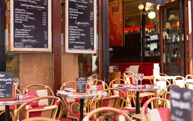
- Embrace the classics
Certain looks are classics for a reason, as long as it works with your restaurant’s menu. French bistros, 1950s-style diners, or a classic pizzeria-inspired look can all lend a sense of nostalgia while still having a modern twist.
 picture: Restaurant design ideas
- Community-centered design
Food is a great equalizer, and restaurants can bring a community together. To create a community-centered experience in your restaurant, try adding a communal table, removing TVs, or offering board games for guests to play while they wait.
 picture: busy restaurant
- Location-based design
Sometimes your decor will decide itself. A seafood restaurant on the water will call for blues and whites, light wood, and tasteful nautical touches, while a BBQ joint in Texas is going to set an entirely different set of expectations. Take a look around you and think about what customers will expect when walking into your restaurant.
 picture: Restaurant interior
- Be mindful of lighting
Good lighting creates ambiance for your guests. Take the time to think about what type of environment you want to create and how you want your guests to feel in your restaurant. Aside from the feel of the restaurant, other things to consider when choosing your lighting include energy efficiency, staff safety, and whether you want customers to get a good shot of their plate for social media.
 picture: Restaurant lighting
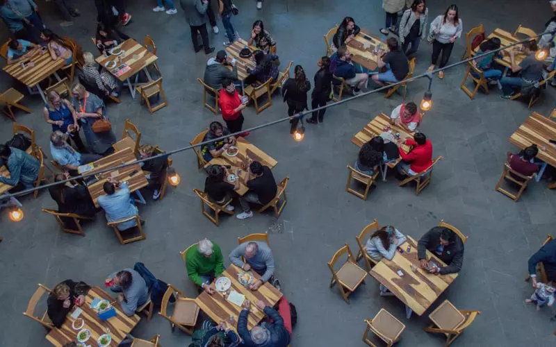
- Functionality is key
Function can be far less fun to implement than design, but a well-functioning restaurant can make a significant impact on your bottom line. Hire a professional designer to plan your layout and maximize function. A small space doesn’t necessarily need to feel crowded or cramped!
 picture: Restaurant seating
Restaurant Design Tips from HGTV’s Taniya Nayak
From acoustics so bad you wish earplugs were on the menu to clichéd decor, hackneyed—or just plain bad—restaurant design can leave a bad taste in a guest’s mouth. When it comes to dining out, the ambiance can be as important as the cuisine, and unpalatable design should never compromise the experience.
We tapped award-winning Boston-based designer Taniya Nayak—who has lent her refined eye to hub hotspots like Lower Mills Tavern and starred on the Food Network’s Restaurant: Impossible along with several HGTV shows—to school us on some of her go-to pro tips for intelligent restaurant design.
Take a seat
“One of the best tips I can offer is to sit in every seat [in the restaurant]. Sometimes this needs to be done mentally as you work off of your drawings. Be sure that every guest in every seat is looking at something nice!”
Bright lights, big problem
“Bright lights are for cafeterias. Ambient lighting is everything when it comes to a proper dining experience. Set the mood with lighting that is dimmable and adjust it accordingly throughout the day. Leave the fluorescent lights in the kitchen.”
Don’t hide the host
“I often see a host stand set up in an area where they cannot see the guests—or the guests cannot see them—as they enter. A warm hello and welcome greeting is the guests’ very first impression of the place. This should never be overlooked or deemed unimportant.”
Consider sound and materials
“Tile and wood look great together, but they often send sound waves bouncing off the walls. Be sure to incorporate some type of soft seating (upholstered banquettes, bar stools, or dining chairs), acoustical ceiling tiles, or even soft drapery to help absorb the noise. Plus, it looks great!”
Read between the lines
“If you’re designing a restaurant, don’t forget to read the menu or chat with the chef! The design [of the space] should always have a tie to the food that is being served. Let’s face it: eating sushi in a country kitchen could seem a little odd.”
Let history repeat itself
“I always try to grab hold of a piece of history of that space or the area. Locals and tourists always seem to appreciate a good story. My husband and I just opened up Yellow Door Taqueria in Dorchester, Massachusetts. It used to be an iconic antique store for over 20 years—a favorite corner shop in the neighborhood. In coming up with the design concept, we wanted to hold on to the history by designing a taqueria that has the look and feel of an old antique shop. The place turned out great, and, more importantly, the guests seem to really appreciate that we went in that direction.”
Don’t forget where you came from
“Start out with a really strong concept board. Sometimes things shift and get sidetracked during the process because some fabrics are no longer available or the budget constraints require finding alternatives. It is always good to check back to the original intent.”
Designing and starting a restaurant is a big undertaking. Luckily, there’s software that can make your day-to-day operations much easier and efficient. Chat with one of our restaurant experts to learn how Lightspeed can give you the tools your restaurant needs to thrive and grow.


