Symmetry and asymmetry - two design principles that seem to exist on opposite ends of the spectrum. When it comes to creating visually appealing interiors, can we really choose between the two? The answer lies in finding the right balance. Too much symmetry can result in a dull and monotonous space, while too much asymmetry can leave a room feeling unbalanced and uncomfortable. In this article, we will explore the significance of both symmetry and asymmetry in interior design, and how they can be used to create captivating spaces that are both visually appealing and harmonious.
Symmetry vs. Asymmetry: The Power of Balance and Proportion
Symmetry refers to the arrangement of elements in a space that creates a sense of balance and proportion, often revolving around a central axis. It is a principle commonly employed in traditional or formal design styles, lending a sense of stability and order to a room. Take, for example, this elegant formal living room designed by Linda Merrill in a classic 19th-century brownstone in the South End of Boston. The placement of objects and furniture on either side of the fireplace creates a visually balanced space that exudes a timeless charm.
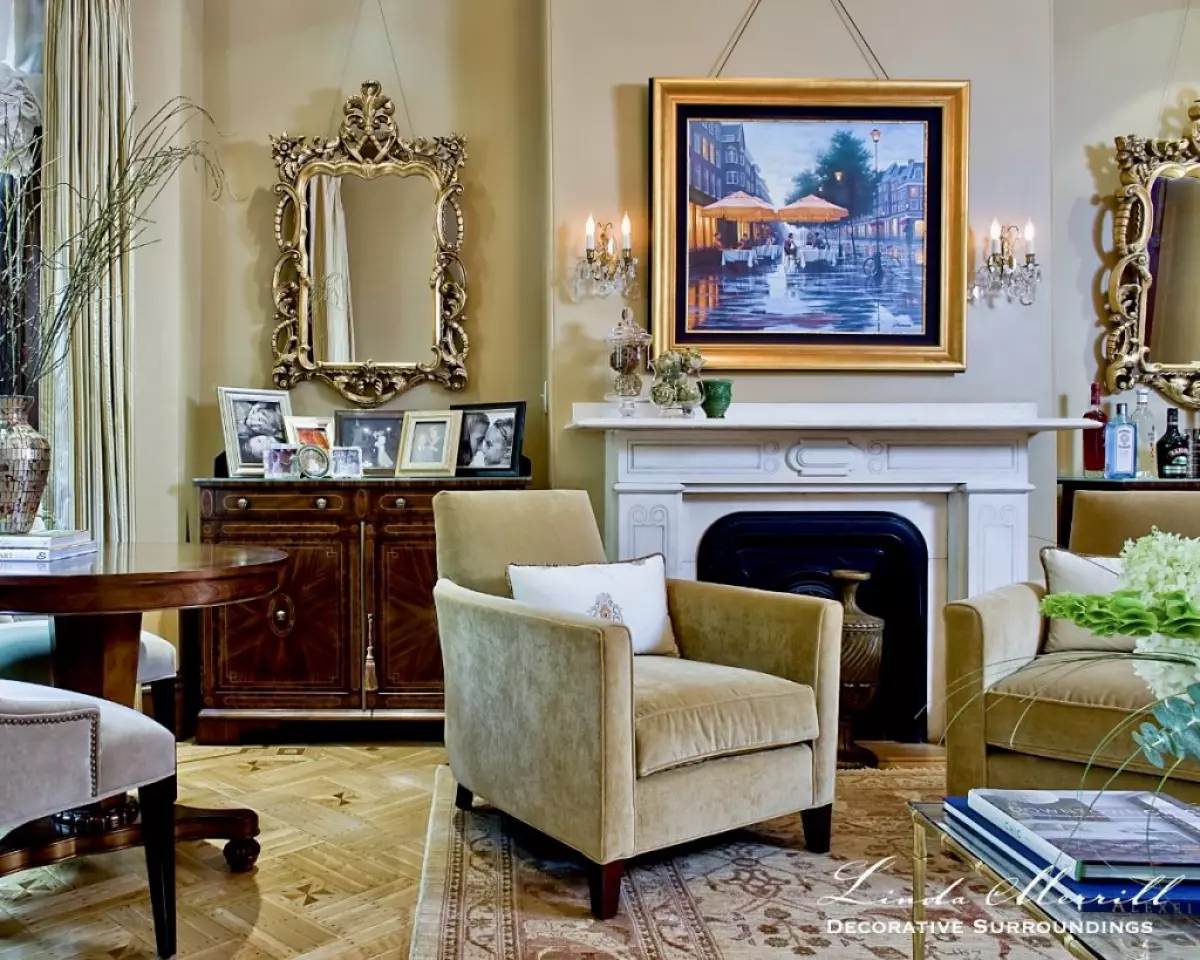 Image: Linda Merrill Decorative Surroundings South End Boston 02118 brownstone formal living room fireplace chairs Symmetry Vs. Asymmetry
Asymmetry, on the other hand, embraces a lack of balance and proportion in design. It involves mixing and matching different elements, styles, and textures to create an eclectic and dynamic space. Linda Merrill showcases this concept in a mixed-use living room in Hingham, where a double-symmetrical layout adds a touch of intrigue. The foreground seating area is centered on a large wall unit, while the back part of the room achieves balance on both sides of the French doors. This blend of symmetry and asymmetry creates a harmonious yet engaging environment.
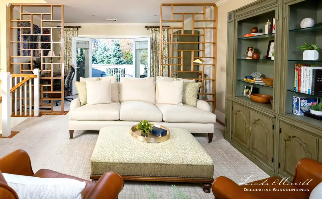 Image: Linda Merrill Decorative Surroundings Hingham Sitting Room and Home Office Work From Home 1
The Impact of Symmetry
Symmetry not only provides a sense of stability but also enables a room to feel cohesive and organized. This principle is not limited to traditional or formal designs, as exemplified in the image below. In a more contemporary context, the center round mirror is balanced by the sconces on either side. The steel band detail on the left side of the table mirrors the vase with branches on the right, creating a highly symmetrical vignette that adds a modern touch to the space.
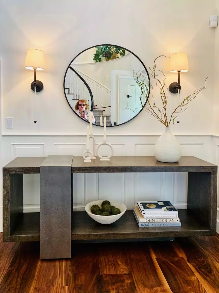 Image: Symmetry Vs. Asymmetry, Design by Holly Gagne, Photo by Linda Merrill
The Dynamic Appeal of Asymmetry
Asymmetry brings movement and energy to a space, making it an ideal choice for those seeking a more eclectic or modern design style. By incorporating different furniture styles, textures, and sizes, Linda Merrill demonstrates the power of asymmetry in creating visually interesting interiors. In a vignette for her digital magazine Surroundings, she combines a bold modern painting with a delicate traditional chair and a rustic faux-bois console table. The result is an artful imbalance that captures the eye and adds a touch of playfulness to the room.
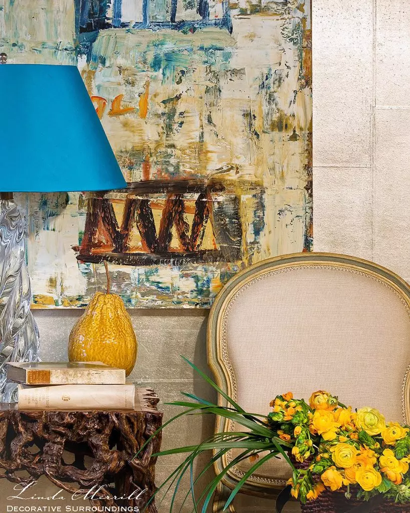 Image: Linda Merrill design photographed by Michael J Lee faux bois sideboard with lamp how to place lamps Symmetry Vs. Asymmetry
Striking the Perfect Balance
Ultimately, the choice between symmetry and asymmetry in interior design comes down to personal preference and the desired look and feel of a space. Do you gravitate towards cohesion and balance, or are you captivated by movement and flow? Finding the perfect balance between these two principles is the key to creating a harmonious and visually engaging environment that speaks to your unique style and personality.
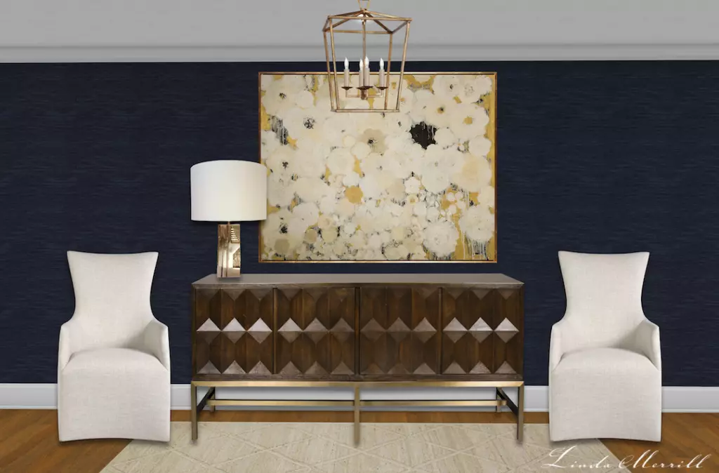 Image: Linda Merrill modern sideboard with single lamp how to place lamps
Next time you embark on a design project, consider the power of symmetry and asymmetry. Play with balance and proportion, mix and match different elements, and allow your creativity to flow. Remember, it's the delicate dance between these two principles that can transform a space from mundane to extraordinary.
Pin for future reference.
 Image: Symmetry vs. Asymmetry


